Inspired by... change
I think pretty much everyone reading this would agree; if there is one thing we can count on in life, it's change.
For most of us, change is usually... uncomfortable.
It kicks us out of our comfort zone. Even change that is immediately perceived as "good" can stretch and challenge us.
And change that results in adversity and trials... well... we always have a choice in how we respond.
We can let them make us bitter... or better.
Like the oyster that wraps that irritating piece of sand in layer after layer of beauty, ultimately producing a pearl, my hope would be that we all make the choice to be better.
I'm a little late with my Photo Art Friday submission this week. But better late than never, right?
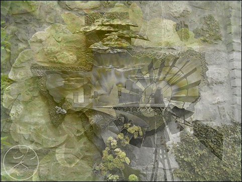
I had fun with Bonnie's challenge to use three photos and one of her textures to create an abstract.
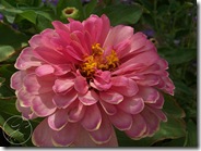
These are the three photos I chose:
And Bonnie's texture, old master dust:
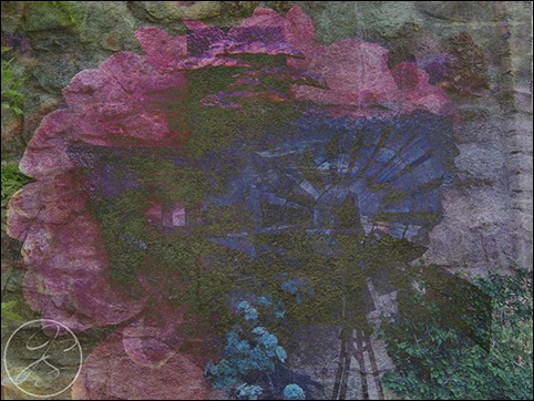
I played around with the opacity of the picture layers and then added the texture on top. The one at the top of this post was done using the luminosity blend at about 80%. I played around a bit more and came up with these:
The Hue blend is my favorite. What's yours?
I wish I had some photos of bluebonnets to really complete the Texas theme, but I don't (yet) so the zinnia will have to do.
I wish Bonnie's challenge was the only one I was facing this week. But that's not the case, and I'm sure it's not for you either.
Jesus referred to heaven as "a pearl of great price." It's value is far greater than anything we have in this world. Responding to adversity in a Christ-like manner isn't easy. But when we do, a little bit of heaven shines through. And you never know who may be touched by the light.
Remember the oyster.
Blessings,
Sharing inspiration here:


The first photo: Simply the beautiful. Fonts are gorgeous :)
ReplyDeleteBlend mode Hue 100% is my favourite. Wonderful 3D-effects. Colors are so harmony. Nice combosition :)
Very nice work.
ReplyDeleteI like both versions.
Regards and best wishes
Yep - the Hue Blend is my favorite, also. Beautiful composition. Thanks so much. Karen
ReplyDeleteI love the soft, somewhat monochromatic effect you achieved with Hue blend mode. Hope the adversity soon passes and that next week your only challenge will be Photo Art Friday June. Take care.
ReplyDeletegreat renderings!
ReplyDeleteI too like Hue Blend, but often Difference does the trick for me. Nice work here.
ReplyDeleteFunny enough I never really use the Hue blend a lot, I usually go to Overlay/Hard Light first, I like what you have done in the abstracts.
ReplyDeleteI am sharing this with my little one.. she has so many anxious moments... Thank you for being a blessing
ReplyDeleteLovely images and I like the different effects you have achieved. Thanks for sharing about the Oyster, precious!
ReplyDeleteBlessings Suzanne